
Folsom Prep

Overview
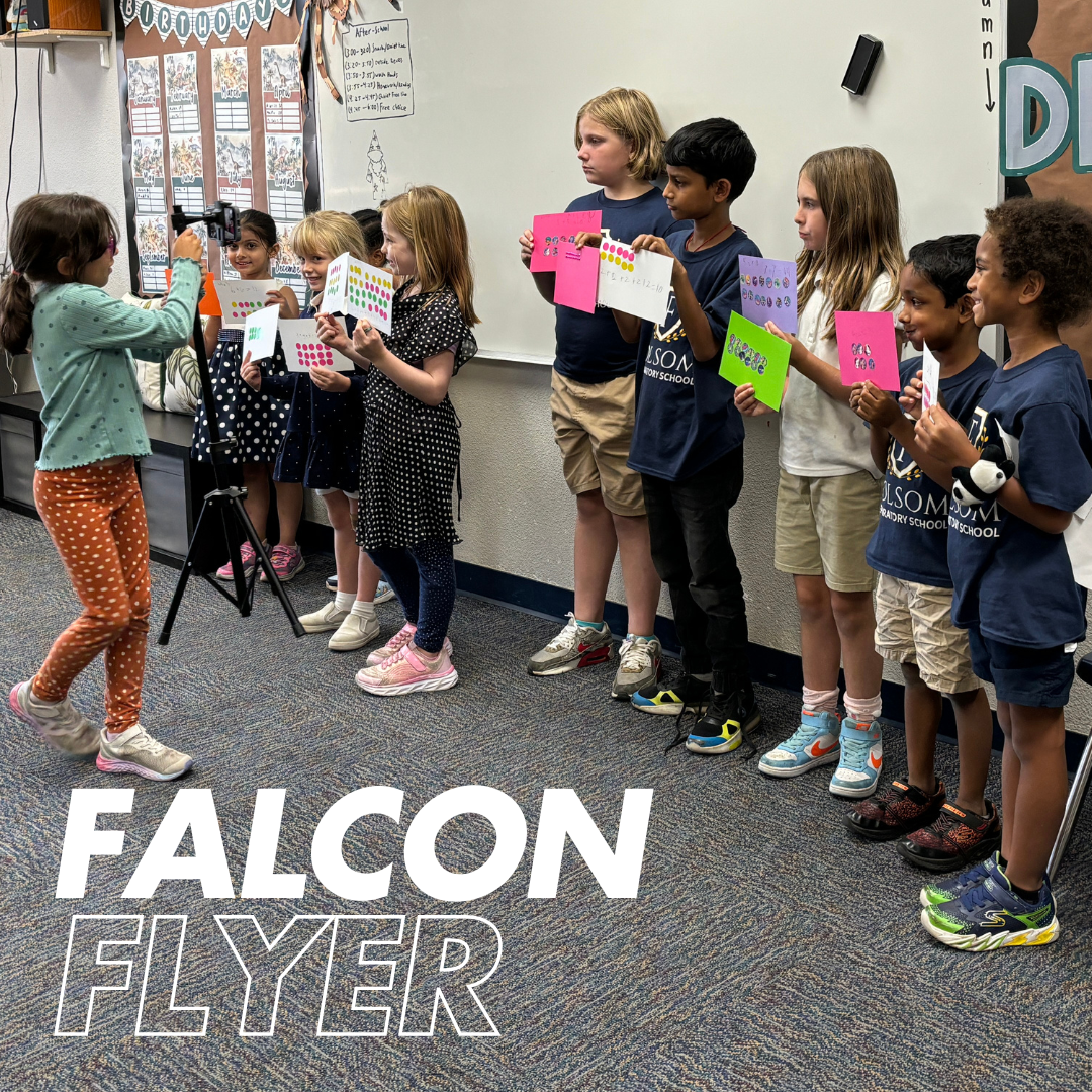
As of August 2024, I have worked on many graphic design projects for Folsom Preparatory School. Works I have created include billboards, social media graphics, flyers, and much more. Included here are a few examples.
For every project, my goal is to maintain the school’s brand identity, while also portraying an approachable and lighthearted feel. I change the style of design based on whether it is advertising material or a project designed for student use. I am given full creative control on these projects, with a few rounds of feedback from my supervisors.

Spelling Bee
For the school’s Annual Spelling Bee Competition, I created the program, as well as name tags for the participants and the volunteer officials. Sticking to the blue and yellow school colors, I created a simple layout with a friendly font, a bee illustration, and bee imagery, including the honey border and the dotted lines.
For privacy, I have redacted the names of the participants and volunteers. The same theme and imagery was used for the name tags, as well.

Information Night Flyers
The task for this project was to create two versions of a flyer advertising the school’s Information Night. One flyer would include a longer paragraph about the school, and the other would have a bulleted list highlighting the benefits of attending the institution.
I chose to incorporate photos of children from every grade, and to use the school colors of blue and yellow to get a sense of the brand identity. I focused on hierarchy, calling attention first to the title and school, then the date and time, then the information about the school, including contact information.

Information Night Billboard
I was given the opportunity to create a few billboard designs advertising Information Night. These designs would be displayed on a billboard at a local shopping center, right off a busy freeway exit. My intention was to create a simple layout with eye catching colors and minimal information.
Working with my supervisors and the board, I made three different layouts, one pictured here, which were displayed every few minutes over the span of a few months. I unfortunately could not capture a professional image of the billboard, so I used a mockup as an alternative.


Social Media Graphics
I work directly with the marketing manager for the school, and sometimes am tasked with making social media posts. Here is one example from the school’s Instagram where we highlighted the WOW teams, which are extracurricular groups focusing on teaching the students various life skills.