Steeped

Overview
The task for this project was to create an organic, fair trade chocolate brand. Along with designing three different flavors, we researched packaging and production requirements for fair trade and organic products. I gained a new perspective on design through learning about the sourcing of ingredients and sustainability in packaging.
Initial Explorations
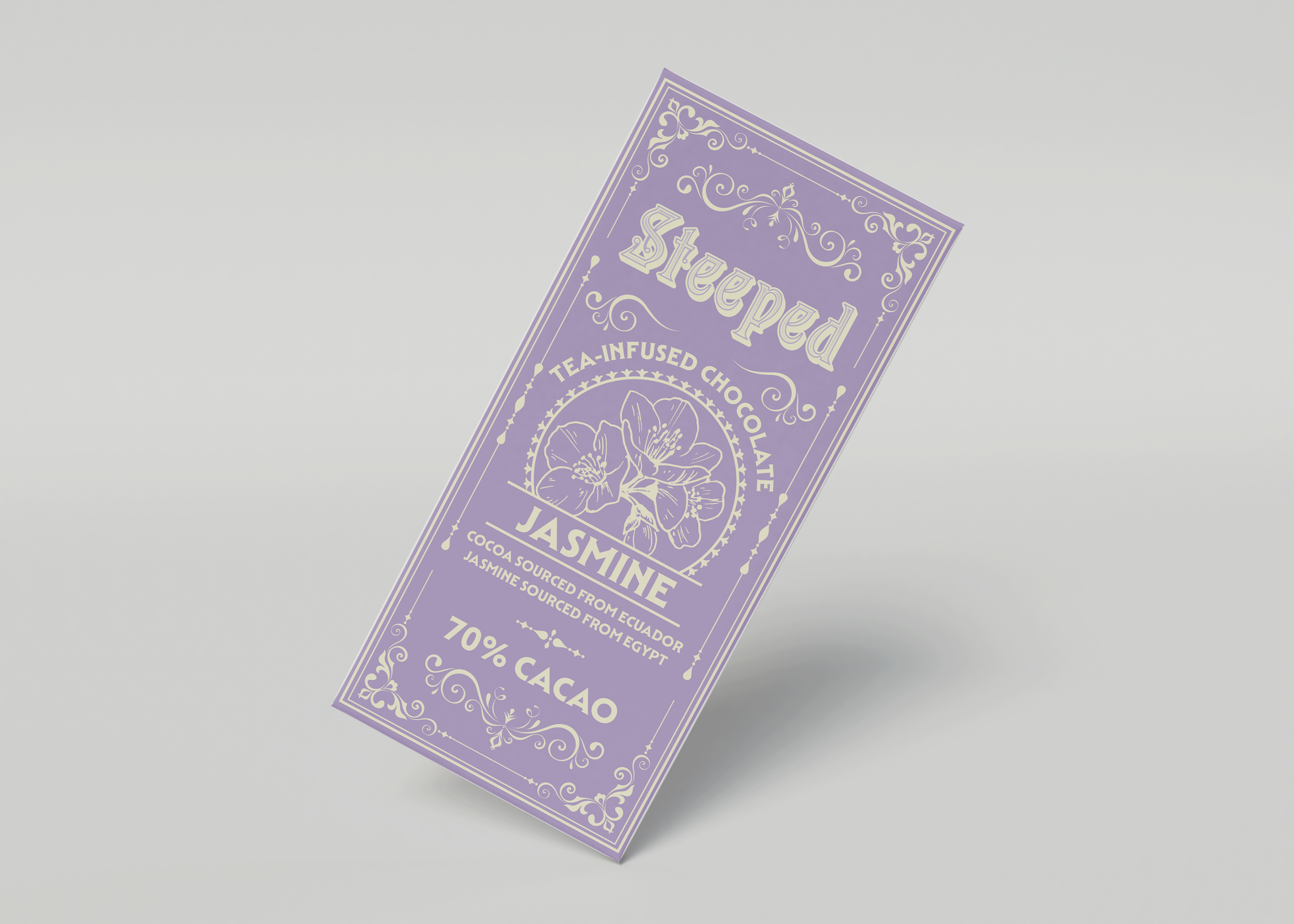
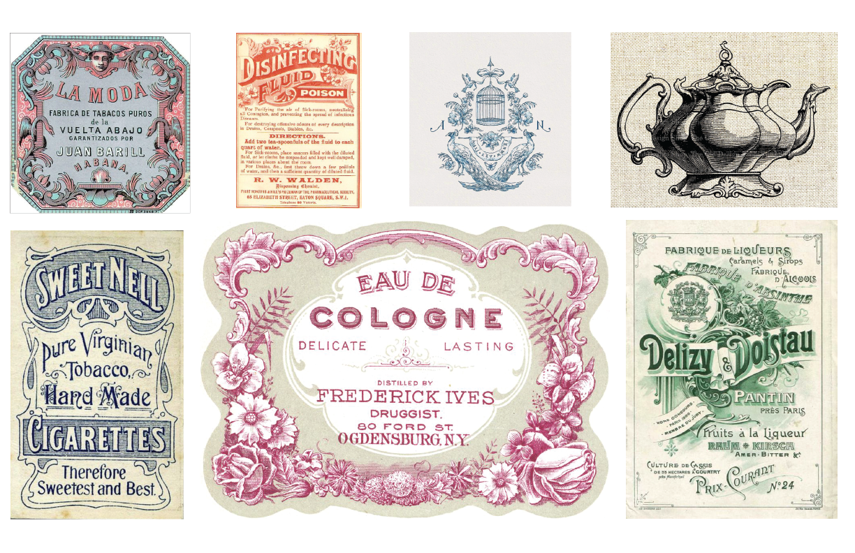
For this project, I decided to create a tea infused chocolate brand. The name "Steeped" I felt captured the idea of tea, while also referencing that the tea flavors were a part of the chocolate. I knew I wanted the packaging to have a vintage feel, because when I think of tea, I think of antique teacups. For my mood board, I gathered images of Victorian era advertisements, as well as other artworks that had a similar feel. I chose to use a typographic logo, customizing fonts to resemble headlines in the mood board.

Color Palette and Typography
I used a pastel color palette, inspired by the artwork I saw in my research. Each chocolate bar uses two colors: one that represents the flavor, and then a pastel yellow that I thought resembles a light gold. I wanted the typography to have a classic feel, so I stuck with serifs. I used three different fonts: Pentz, which I modified for the logo; Mendl Serif for headers; and Benguiat Pro ITC for body text.
Process
For the design, I brought in a lot of ornamental elements that I thought resembled antique teacups. Each flavor had an image of the flower that the tea was derived from which helped to visualize the product and also differentiate each flavor's design. I made sure to include all the required packaging information and I also chose ingredients based off existing organic chocolate and tea companies. The brand story explains what the product is, as well as the sustainability mission, which was a vital aspect of this project.