
Multipage
Overview
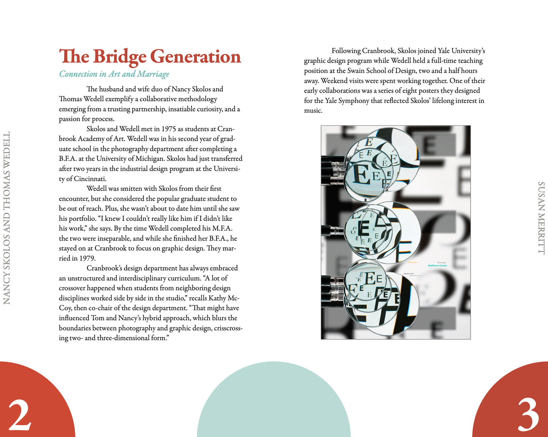
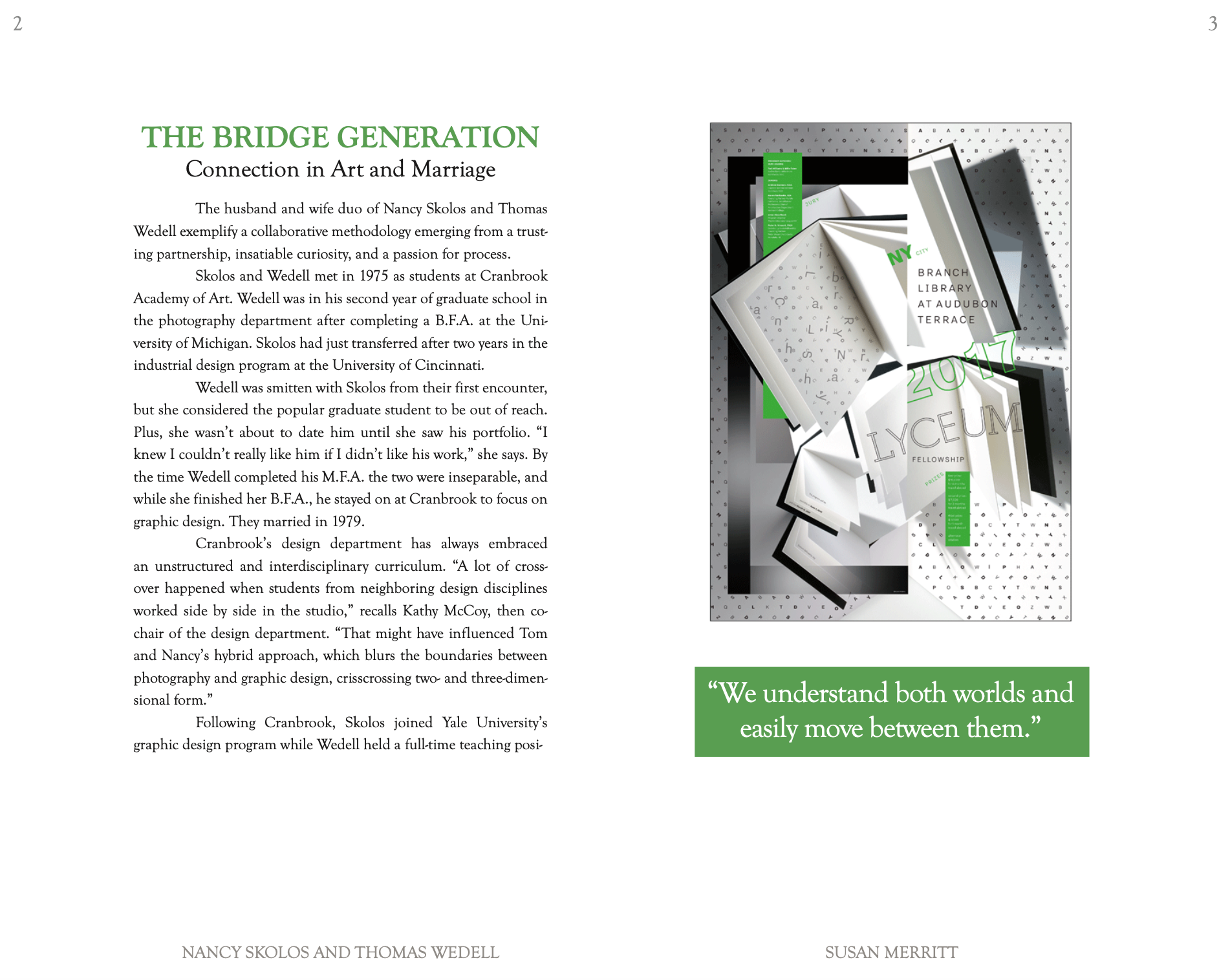
The objective of this project was to create a multipage layout, using an article about designers Nancy Skolos and Tom Wedell, written by Professor Susan Merritt. The layout consisted of a cover, title page, table of contents, the article text, a running header or footer, folios, quotes or callouts, and images. This project provided an opportunity to study grids, detailed typesetting, and a cohesive design system.

Initial Explorations
I decided to base my first explorations and layout variations on different designs by Skolos and Wedell. The key aspects I focused on in these iterations were grid, indentation style, color, and creating a layout that could transfer to other pages. In the end, I used different aspects from each of these designs in my final layout.


Color Palette and Typography
The image I chose for the cover contained mainly blue, white, gray, and black. So, I used these colors throughout the layout to make a cohesive design. We were limited to a few select fonts to choose from, so that our main focus was on typographical details and layout. I decided to use Kings Caslon, as I thought it looked best in my initial explorations.

Process
For the final layout design, I decided to use no indentation, and indicate a new paragraph by using extra spacing. I kept the leading open enough to give breathing room between each line of text while still letting readers' eyes move easily down the paragraph. I stuck to a strict column in which all body text and imagery were confined to. The only elements that were placed outside of it were the rectangular decorative shapes and the page numbers, which were still placed using another consistent grid system. Body text and headers are in black, while page numbers and footers are in gray, in order to create a sense of visual hierarchy.


Final Flat Layouts


Final Applications
