Bia

Overview
The task for this project was to create three flavors and carrier packaging for a new beverage company. We conducted thorough research into beverage production and manufacturing, packaging requirements such as government warnings, proper labeling, and market competitors.
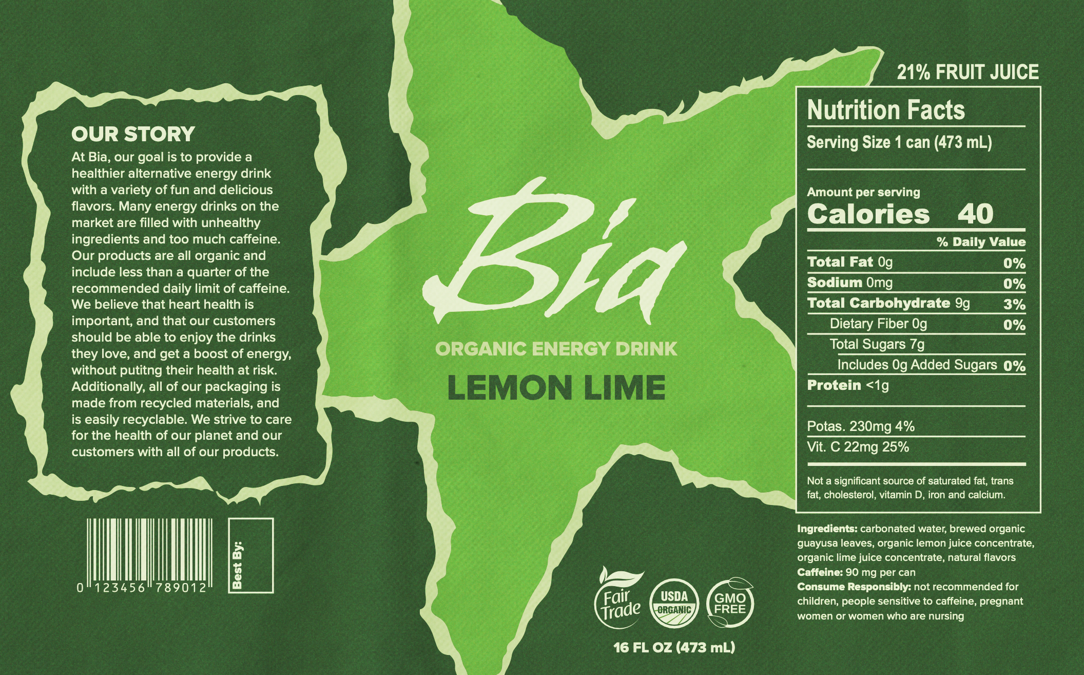
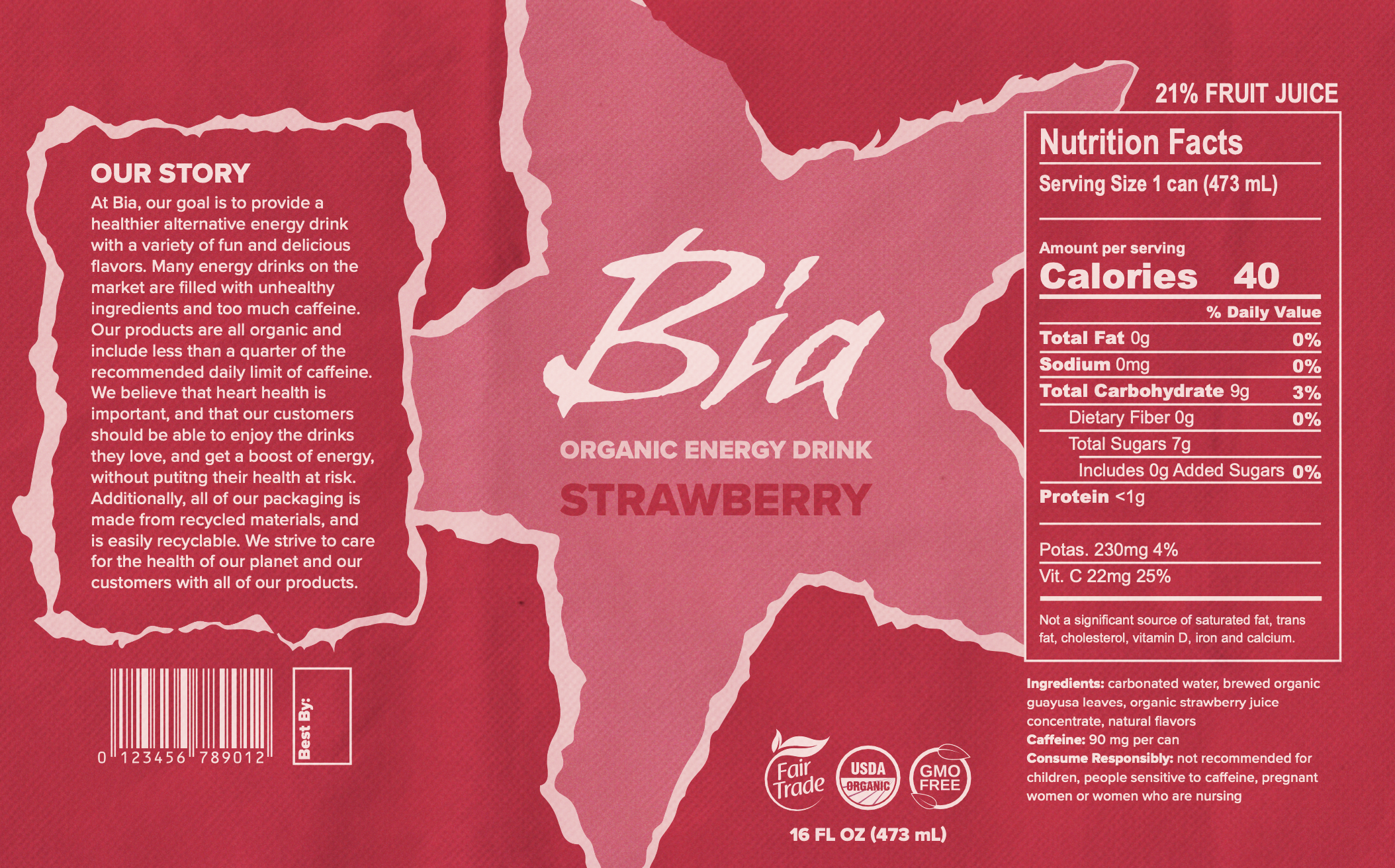
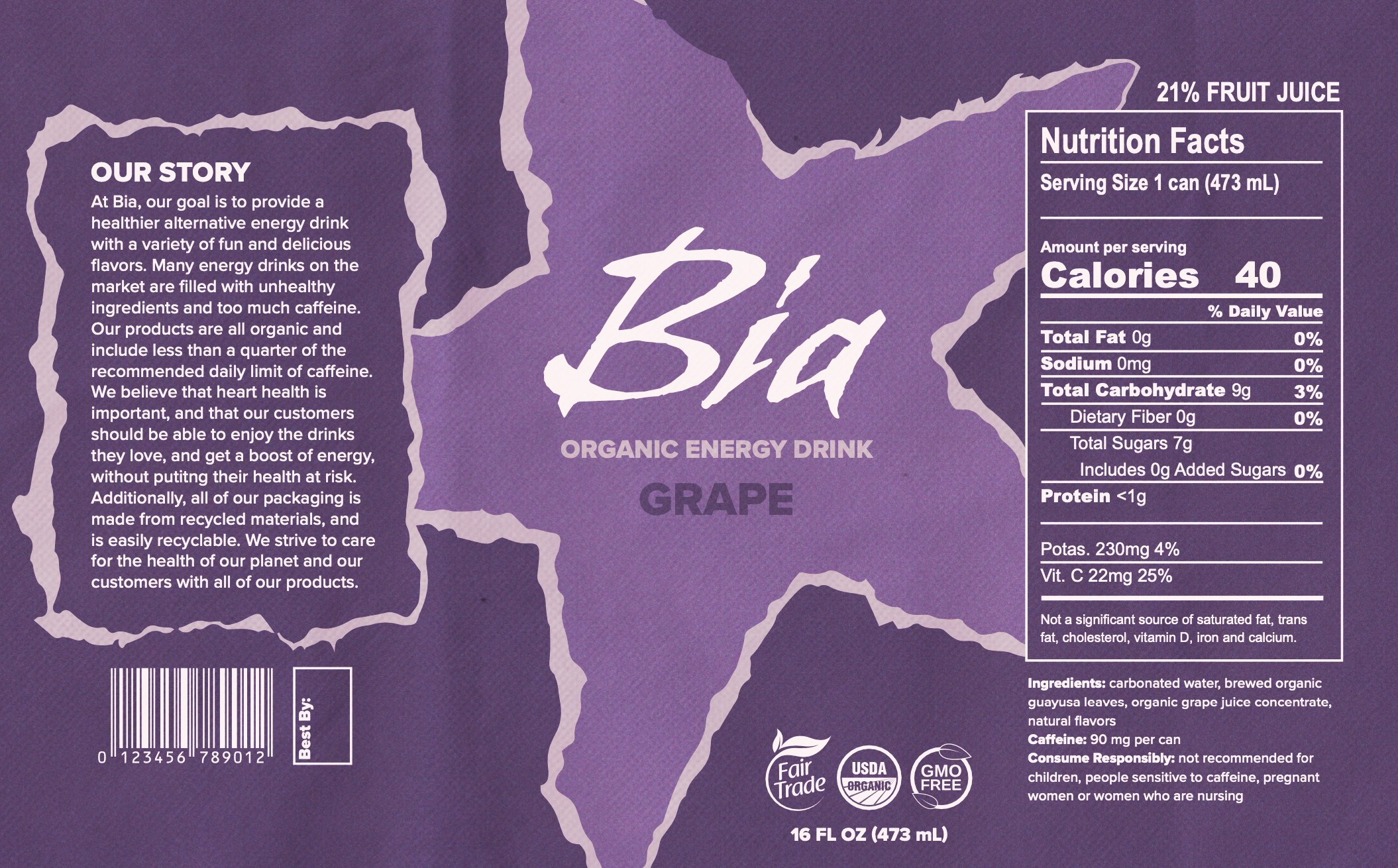
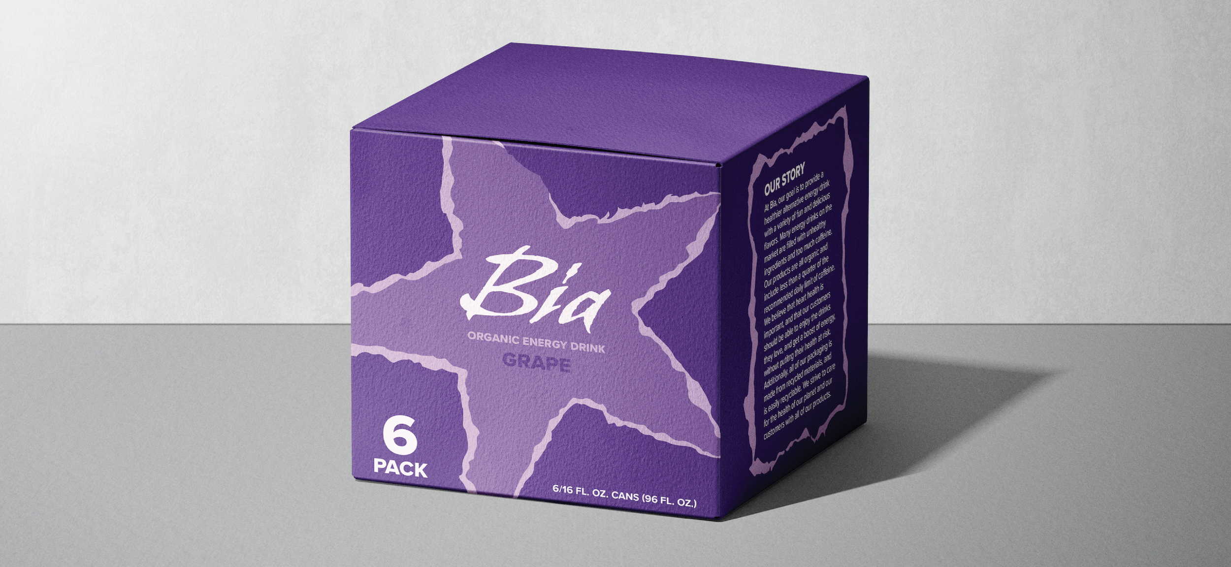
I decided to create an organic energy drink brand that focused on sustainability and heart health. Many of the most popular energy drinks use unhealthy ingredients; even many organic energy drinks contain too much caffeine. I wanted this brand to only use organic and ethically sourced ingredients, and to limit the amount of caffeine, so consumers would not have to worry about going over the recommended daily limit. Additionally, the packaging would be sustainably made and recyclable. Words I associated with this brand are bold, bright, sustainable, accessible, and fun. The name I chose, Bia, refers to the Greek goddess of strength and power.

Initial Explorations
In my research, I saw that most other organic energy drinks used muted colors and theming around nature. I wanted to design in the opposite direction as a way to stand out from competitors; so, I chose to use vibrant colors and grainy, paper-like textures. My mood board consisted of bright color palettes and fun typography. At this stage, I was still unsure of whether I wanted the type to give a vintage or handwritten feel.

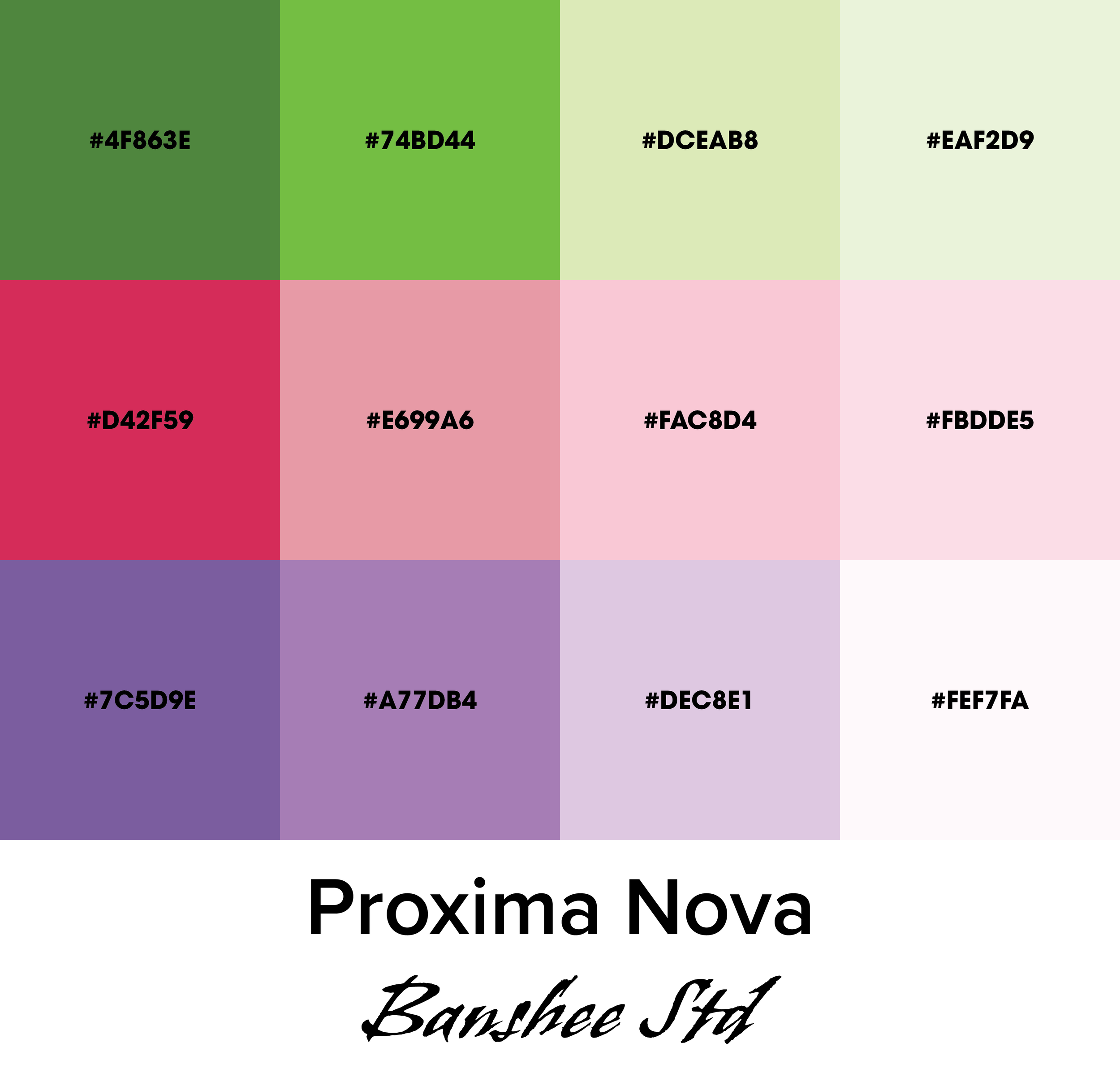
Final Color Palette and
Typography
The three flavors I chose were grape, strawberry, and lemon lime, which are represented by monochromatic purple, pink, and green designs, respectively. For the logo, I used the font Banshee Std to convey an energetic feel, and for the body text I used Proxima Nova, which balanced out the logo.
Process
For this design, I chose to use shapes with jagged edges that resembled torn paper; I thought this gave the can an energetic feel. I furthered this by using a star for the main shape, as this refers to the idea of energy. I also incorporated a paper and grain texture overlay throughout the can. The required information includes a bar code, expiration date, fair trade label, organic label, non-GMO label, ounce and millimeter measurements, caffeine amount and caffeine warnings, nutrition facts, and ingredient information. I sourced my ingredient and nutrition fact information from existing organic energy drink brands that I wanted to emulate. Finally, the "Our Story" section explains the background of the brand and its mission.